7.22 Tdscale and lrscale widgets
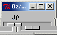
local
   S R
   Desc=lrscale('from':0 to:100
                init:10
                handle:S
                action:proc{$} {Show {S get($)}} end
                return:R
               )
in
   {{QTk.build td(Desc)} show}
   {Wait R}
   {Show R}
end
7.22.1 Description
A scale is a widget that displays a rectangular trough and a small slider. tdscale displays a vertical slider while lrscale displays an horizontal one. The trough corresponds to a range of real values determined by the from, to, and resolution options. These values can also be specified as integers. The position of the slider selects a particular real value. The slider's position (and hence the scale's value) may be adjusted with the mouse or keyboard. Whenever the scale's value is changed, an Oz command is invoked (using the action option) to notify other interested widgets of the change.
Three annotations may be displayed in a scale widget: a label appearing at the top right of the widget (top left for horizontal scales), a number displayed just to the left of the slider (just above the slider for horizontal scales), and a collection of numerical tick marks just to the left of the current value (just below the trough for horizontal scales). Each of these three annotations may be enabled or disabled using the configuration options.
7.22.2 Parameter List
Specific Parameters
'from' 1 action actionh bigincrement digits init label length resolution return showvalue sliderlength sliderrelief state tickinterval to width
Non Specific Parameters
activebackground background borderwidth cursor feature font foreground glue handle highlightbackground highlightcolor highlightthickness look onCreation padx pady relief repeatdelay repeatinterval takefocus throughcolor tooltips
7.22.3 Method List
'raise'
'raise'(1:W): If the W argument is omitted then the command raises the widget so that it is above all of its siblings in the stacking order (it will not be obscured by any siblings and will obscure any siblings that overlap it). If W is specified then it must be a handle to another widget that is either a sibling of this widget or the descendant of a sibling of this widget. In this case the 'raise' command will insert this widget into the stacking order just above W; this could end up either raising or lowering the widget.
bind
bind(event:E action:A args:LA append:AP): Specifies an action LA to execute when the event E is triggered.
Actions can be specified either as a procedure, a pair
Port#Messageor a pairObject#Method(see Section 4.3.3).Events are strings (see Section 8.11.1).
The list of arguments
LAspecifies supplementary information to pass to the action, like the key code of a keypress, or the mouse coordinates of a mouse button click (see Section 8.11.2). IfLAif not specified,nilis assumed.The boolean
appendparameter specifies if the binding overrides the previous binding for this event, or adds a supplementary action. If not specified,falseis assumed.
get
get(parameter1:Variable1 ... parameterX:VariableX): Obtains the value of one or more parameters. parameterX must be a valid parameter for the widget. VariableX must be free variables that will receive the current value of the parameters.
getFocus
getFocus(force:B): if B is false (or by default): if the application currently has the input focus on the widget's display, this command resets the input focus for the widget's display to the widget. If the application doesn't currently have the input focus on the widget's display, the widget will be remembered as the focus for its top-level; the next time the focus arrives at the top-level, it will be redirected it to the widget. If B is true: sets the focus of the widget's display to the widget, even if the application doesn't currently have the input focus for the display. This command should be used sparingly, if at all. In normal usage, an application should not claim the focus for itself; instead, it should wait for the window manager to give it the focus. B must be a boolean.
getGrabStatus
getGrabStatus(1:V): Binds V to the atom none if there is no grab on the widget, to the atom local if there is a local grab and to global if there is a global grab. V must be a free variable.
lower
lower(1:W): If the W argument is omitted then the command lowers the widget so that it is below all of its siblings in the stacking order (it will be obscured by any siblings and will not obscure any siblings that overlap it). If W is specified then it must be a handle to another widget that is either a sibling of this widget or the descendant of a sibling of this widget. In this case the lower command will insert this widget into the stacking order just below W; this could end up either raising or lowering the widget.
releaseGrab
releaseGrab: Releases the grab on the widget if there is one, otherwise does nothing.
set
set(parameter1:value1 ... parameterX:valueX): Changes the value of one or more parameters. parameterX must be a valid parameter for the widget. valueX must be a valid value for the parameter.
setGrab
setGrab(global:B): Sets a grab on the widget. If B is true then the grab is global, otherwise it is local (B false by default). If a grab was already in effect for this application then it is automatically released. If there is already a grab on the widget and it has the same global/local form as the requested grab, then the command does nothing. Local grab affects only the grabbing application: events will be reported to other applications as if the grab had never occurred. A global grab locks out all applications on the screen, so that only the given subtree of the grabbing application will be sensitive to pointer events (mouse button presses, mouse button releases, pointer motions, window entries, and window exits). During global grabs the window manager will not receive pointer events either. Warning: whe a grab is set, it is define for the whole Oz process so that it will prevent the user to do input to other windows as well. Moreover a grab is still effective even if the window that contains the grabbed widgets is hidden. B must be a boolean.
winfo
winfo(parameter1:value1 ... parameterX:valueX): This commands works like the get method, but for window-related information. For more details, see Section 8.9.
7.22.4 Detailed Parameters List
'from'
'from':F: A real value corresponding to the left or top end of the scale.
1
1:R: Specifies the value of the scale. Valid with the set() and get() methods only. When setting this parameter, R must be a real or an integer. When getting this parameter, the returned value is always a real.
action
action:C: Specifies an action to execute right after the user modified the position of the slider of the scale. C can take several different forms (see Section 4.3.1).
actionh
actionh:C: Similar to the action parameter where then handle of the widget is given as a parameter to the action to be executed. This parameter overrides the action parameter when present.
bigincrement
bigincrement:F: Some interactions with the scale cause its value to change by ``large'' increments; this option specifies the size of the large increments. If specified as 0, the large increments default to 1/10 the range of the scale. F must be a float.
digits
digits:I: An integer specifying how many significant digits should be retained when converting the value of the scale to a string. If the number is less than or equal to zero, then the scale picks the smallest value that guarantees that every possible slider position prints as a different string.
init
init:R: Specifies the value of the scale. Valid at creation time only. R must be a real.
label
label:VS: A string to display as a label for the scale. For vertical scales the label is displayed just to the right of the top end of the scale. For horizontal scales the label is displayed just above the left end of the scale. If the option is specified as an empty string, no label is displayed.
length
length:P: Specifies the desired long dimension of the scale. For vertical scales this is the scale's height; for horizontal scales it is the scale's width. P must be a valid screen distance (see Section 8.6).
activebackground
activebackground:C: Specifies the background color to use when drawing active elements. An element (a widget or portion of a widget) is active if the mouse cursor is positioned over the element and pressing a mouse button will cause some action to occur. For some elements on Windows and Macintosh systems, the active color will only be used while mouse button 1 is pressed over the element. C must be a valid color (see Section 8.2)
background
background:C: or bg:C: Specifies the normal background color to use when displaying the widget. C must be a valid color (see Section 8.2).
borderwidth
borderwidth:P: Specifies a non-negative value indicating the width of the 3-D border to draw around the outside of the widget (if such a border is being drawn; the relief option typically determines this). The value may also be used when drawing 3-D effects in the interior of the widget. P must be a valid screen distance (see Section 8.6).
cursor
cursor:A: Specifies the mouse cursor to be used for the widget. A must be a valid cursor (see Section 8.7)
feature
feature:A: Specifies a feature name for the container object to reference the object controlling this widget. For more details, see Section 4.2. A must be an atom.
font
font:F: Specifies the font to use when drawing text inside the widget. This parameter can't be get at runtime, however it can be set. F must be a valid font (see Section 8.8)
foreground
foreground:C: or fg:C: Specifies the normal foreground color to use when displaying the widget. C must be a valid color (see Section 8.2)
glue
glue:A: Specifies how a widget must fit in its own available place. A must be an atom that is any combination of n, s, w and e. If a direction is specified, the corresponding border is glued to its neighbor or border of the frame if there is no neighbor. If a direction is not specified, the corresponding border if such that the widget takes just the width or height it needs to draw itself. If none of opposite directions is specified, the widget is centered. For more details, see Section 4.1.
handle
handle:V: Specifies a variable to reference the object controlling this widget. This variable is bound when the window is built. For more details, see Section 4.2. V must be a free variable.
highlightbackground
highlightbackground:C: Specifies the color to display in the traversal highlight region when the widget does not have the input focus. C must be a valid color (see Section 8.2)
highlightcolor
highlightcolor:C: Specifies the color to use for the traversal highlight rectangle that is drawn around the widget when it has the input focus. C must be a valid color (see Section 8.2)
highlightthickness
highlightthickness:P: Specifies a non-negative value indicating the width of the highlight rectangle to draw around the outside of the widget when it has the input focus. If the value is zero, no focus highlight is drawn around the widget. P must be a valid screen distance (see Section 8.6).
look
look:L: Specifies a look to use for the widget. A look specifies default values for the parameters of widgets. This parameter can be specified at creation time only. Moreover changing a look will not change the appearance of widgets that are already displayed with that look. See Section 5.1 for more details.
onCreation
onCreation:P: When a widget is created, for example by QTk.build, this parameter specifies an action to execute right after the widget has been created, but before returning from the build instruction. It is usefull if one needs the handle of the widget to initialize it in ways not permitted by its description record (for example binding the Enter or Leave mouse events).
padx
padx:P: Specifies how much horizontal external padding to leave on each side of the widget. This space is added outside the widget border. P must be a valid screen distance (see Section 8.6)
pady
pady:P: Specifies how much vertical external padding to leave on each side of the widget. This space is added outside the widget border. P must be a valid screen distance (see Section 8.6)
relief
relief:A: Specifies the 3-D effect desired for the widget. Must be one of these atoms: raised, sunken, flat, ridge, solid or groove. The value indicates how the interior of the widget should appear relative to its exterior; for example, raised means the interior of the widget should appear to protrude from the screen, relative to the exterior of the widget.
repeatdelay
repeatdelay:I: Specifies the number of milliseconds a button or key must be held down before it begins to auto-repeat. Used, for example, on the up- and down-arrows in scrollbars. I must be an integer.
repeatinterval
repeatinterval:I: Used in conjunction with repeatdelay: once auto-repeat begins, this option determines the number of milliseconds between auto-repeats.
takefocus
takefocus:B: Determines whether the window accepts the focus during keyboard traversal (e.g., Tab and Shift-Tab). Before setting the focus to a window, the traversal mechanims consult the value of the takeFocus option. A value of false means that the widget should be skipped entirely during keyboard traversal. true means that the widget should receive the input focus as long as it is viewable (it and all of its ancestors are mapped). B must be a boolean.
throughcolor
throughcolor:C: Specifies the color to use for the rectangular trough areas in widgets such as scrollbars and scales. C must be a valid color (see Section 8.2).
tooltips
tooltips:VS: Specifies a tooltip for the widget. A tooltip is a small message that appears when the mouse cursor if left still over the widget for a while. If VS is set to nil, no tooltip will appear at all. VS must be a virtual string.
resolution
resolution:F: A real value specifying the resolution for the scale. If this value is greater than zero then the scale's value will always be rounded to an even multiple of this value, as will tick marks and the endpoints of the scale. If the value is less than zero then no rounding occurs. Defaults to 1 (i.e., the value will be integral).
return
return:V: Binds V to the value of the scale when the window is closed. V must be a free variable.
showvalue
showvalue:B: Specifies a boolean value indicating whether or not the current value of the scale is to be displayed.
sliderlength
sliderlength:P: Specifies the size of the slider, measured in screen units along the slider's long dimension. P must be a valid screen distance (see Section 8.6).
sliderrelief
sliderrelief:A: Specifies the relief to use when drawing the slider. Must be one of these atoms: raised, sunken, flat, ridge, solid or groove.
state
state:A: Specifies one of three states for the button: normal, active, or disabled. If the scale is disabled then the value may not be changed and the scale won't activate. If the scale is active, the slider is displayed using the color specified by the activebackground option.
tickinterval
tickinterval:F: Must be a real value. Determines the spacing between numerical tick marks displayed below or to the left of the slider. If 0, no tick marks will be displayed.
to
to:F: Specifies a real value corresponding to the right or bottom end of the scale. This value may be either less than or greater than the from option.
width
width:P: Specifies the desired narrow dimension of the trough. For vertical scales this is the trough's width; for horizontal scales this is the trough's height. P must be a valid screen distance (see Section 8.6).