5.2 Checkbuttons, Radiobuttons, and Variables
checkbuttons
Checkbutton widgets are used for binary choices. An indicator to the left shows whether the button is ``on'' or ``off''. The state of the indicator is given by a tickle variable. A tickle variable is a tickle object that provides messages to set and to query the value of the variable.
radiobuttons
Radiobuttons are used for non-binary choices. Several radiobuttons are linked together to a group. Selecting a radio button de-selects all buttons belonging to the same group and displays a mark in an indicator to the left. Radiobuttons are linked together by tickle variables: all buttons belonging to the same group share the same variable.
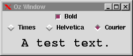
Figure 5.2 shows an example of a checkbutton and a group of three radiobuttons. The value with which the variable V1 is initialized determines whether the checkbutton initially is selected. The value of the variable V2 determines which of the radiobuttons is selected initially.

V1={New Tk.variable tkInit(false)}
C ={New Tk.checkbutton tkInit(parent:W variable:V1
                              text:'Bold' anchor:w)}
V2={New Tk.variable tkInit('Helvetica')}
Rs={Map ['Times' 'Helvetica' 'Courier']
    fun {$ F}
       {New Tk.radiobutton tkInit(parent:W
                                  variable:V2 value:F
                                  text:F anchor:w)}
    end}
{Tk.batch [grid(C     padx:2#m columnspan:3)
           grid(b(Rs) padx:2#m)]}
Figure 5.2: A checkbutton and three radiobuttons.
state
To query the state of the radiobutton and of the checkbuttons we query the state of the corresponding variables. Feeding the following expression
{Browse state(bold:   {V1 tkReturnInt($)}==1
              family: {V2 tkReturnAtom($)})}
displays the values of the variables in the browser. See the next section for a detailed explanation of the tkReturnInt and tkReturnAtom messages.
actions
Very often selecting a checkbutton or a radiobutton must show immediate effect. For this purpose it is possible to attach actions to checkbuttons and radiobuttons in the same way as for buttons. Figure 5.3 shows an example where the checkbutton and the radiobuttons configure the font of a label widget. Note that the options used for initialization of the checkbutton and radiobuttons are the same as in the example shown in Figure 5.2.

fun {GetWeight}
   if {V1 tkReturnInt($)}==1 then bold else normal end
end
F={New Tk.font tkInit(size:24
                      family: {V2 tkReturn($)}
                      weight: {GetWeight})}
L={New Tk.label tkInit(parent:W text:'A test text.' font:F)}
{C  tkAction(action: proc {$}
                        {F tk(configure weight:{GetWeight})}
                        {L tk(configure font:F)}
                     end)}
{List.forAllInd ['Times' 'Helvetica' 'Courier']
 proc {$ I Family}
    {{Nth Rs I} tkAction(action: proc {$}
                                    {F tk(configure family:Family)}
                                    {L tk(configure font:F)}
                                 end)}
 end}
Figure 5.3: Actions for radiobuttons and checkbuttons.
Reference information on radiobuttons and checkbuttons can be found in radiobutton and checkbutton.